Monday, October 29, 2012
House Industries Presents Alexander Girard
House Industries presents Alexander Girard
"Girard worked with George Nelson and Charles and Ray Eames to form a design team that has influenced the fundamentals of design throughout the United States and the rest of the world. Girard initially established a fabric collection based on his architectural training. His first fabric line consisted of plain upholsteries and geometric drapery prints—stripes, circles, and triangles. He went on to create many more patterns and designs, largely inspired by folk art.
"In the mid-1960s, Girard began his design work for Braniff International Airways re-branding – “The end of the plain plane”. This project gave Girard the opportunity to work with textiles, color, and graphics on a grand scale, redesigning everything from the sugar packets to the ticket counters to the color of the planes themselves. He used colors like light and dark blue, beige, ochre, orange, turquoise, and muted yellow to make the planes recognizable from the ground. Italian couturier fashion designer Emilio Pucci designed attendant uniforms.
Saturday, October 27, 2012
Thursday, October 25, 2012
Wednesday, October 24, 2012
Tuesday, October 23, 2012
Monday, October 22, 2012
The Public Side of Paula Scher
Yesterday I saw Paula Scher speak at the Public Theater for which she designed the identity. She is well-known for an array of other work in a variety of styles. I used to think that having a style is important for being an artists but in fact, it can hurt you more than help you. Just like Paula, a good designer should be able to demonstrate many different styles and ways of doing things so they can show a little of everything. Aside from her super formal work like identities (Citi logo, for example), Paula paints. She paints particularly designs of maps, which are now being used to decorate 3-dimensional space, are being sold at shows and she is being commissioned to do more. I wanna be able to stay a designer as well as an artist throughout my career. I must say though, Paula doesn’t just have thrilling work but also a great sense of humor. She made me also consider one thing- deciding on a color scheme perhaps even before the design or the composition. She uses red, black and white in a lot of her pieces…knowing and understanding the relationship of color can really help design work from the thumbnail to the final.
Click the link below to watch a video of her talking. She discusses a lot of what she talked about yesterday and more.
Food Photography
Hi guys,
for all you food photographer wannabes. you gotta start somewhere. haha! Here are a few monday blues pick me ups. There are more on the tumblr page Pictures of Asians Taking Pictures of Food.
Saturday, October 20, 2012
Friday, October 19, 2012
Wednesday, October 17, 2012
Tuesday, October 16, 2012
Mitt Romney's Tax Plan
This is pretty outrageous. I think the concept is amazing.
http://www.romneytaxplan.com
http://www.romneytaxplan.com
Monday, October 15, 2012
Saturday, October 13, 2012
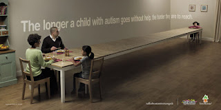
Creative Public Awareness Ads
Act Fast. The longer we delay in helping children with autism, the harder they are to reach. Act fast, act today.
Give A Hand To Wildlife. A masterpiece can always attract a lot of attention.
Liked Helping Terceira Island. The evolution of the thumbs up.
Thursday, October 11, 2012
Branding/Identity/Design blog
Interesting design blog! Focused mainly on branding and identity, but includes other aspects of design as well. On this post, they show the studio Lo Siento and their 3D/4d (readable from all sides) typography.
Wednesday, October 10, 2012
Tuesday, October 9, 2012
Ad of the Day: Smirnoff 'nocturnal awakening'
http://www.adweek.com/news/advertising-branding/ad-day-smirnoff-144285
"Smirnoff enjoy a 'nocturnal awakening' in this colorful, raucous and really quite outlandish spot from JWT"
I LOVE the new Smirnoff ad. It's an exciting celebration, of sound, color and texture. Beautiful imagery and narrative. (Scroll down on the ADweek article to see the video.)
Sunday, October 7, 2012
Saturday, October 6, 2012
Thursday, October 4, 2012
Monday, October 1, 2012
too cute.
Let's see…how to promote a TV show about kittens and puppies? By live streaming kittens 24/7 until the new season begins!
Subscribe to:
Comments (Atom)


