Friday, December 14, 2012
Happy Holidays
Happy Holidays everyone, and safe travels. See you in the New Year!
Here's a fun post, and be sure to sign up for The Daily Heller.
Thursday, December 13, 2012
Thursday, December 6, 2012
Visualizing Mass Transit
Tuesday, December 4, 2012
MILTON GLASER IS SPEAKING AT PRATT MANHATTAN
and nobody told us?
http://prattgradcomd.com/event/13/12/2012/gag-event-milton-glaser
pratt whatchu thinkin', grad comd is still comd.
Milton Glaser, Pratt Manhattan rm 213, 7-9PM Thurs Dec 13
http://prattgradcomd.com/event/13/12/2012/gag-event-milton-glaser
pratt whatchu thinkin', grad comd is still comd.
Milton Glaser, Pratt Manhattan rm 213, 7-9PM Thurs Dec 13
Art of the Title
In Typography we did a project with title sequences and my teacher introduced me to this website. It's really interesting! I've always loved title sequences and the credits for North by Northwest is actually one of the things that led me to graphic design.
Art of the Title
The Universal Arts of Graphic Design
PBS off book video about Graphic Design
Featuring: Debbie Millman, Emily Oberman (Pentagram), Drew Freeman (Pentagram), Steve Attardo
Thursday, November 29, 2012
Furniture Design Uses Type
Ernesto Lago's Work
These clever tables are based off of letter forms. Not just graphic designers get inspired by type :)
These clever tables are based off of letter forms. Not just graphic designers get inspired by type :)
Wednesday, November 28, 2012
Outstanding Guerilla Advertising
This website helped inspire me when working on guerilla ad concepts. A guerilla ad can really be anything and the boundaries of advertising are being pushed far beyond just a pretty-looking print ad.
I would keep this link in mind for future reference
I would keep this link in mind for future reference
Tuesday, November 27, 2012
Cool Web Layout
Pitchfork had a really awesome pop up ad for this ty segall article, and the web layout for the article is even cooler
http://pitchfork.com/features/cover-story/reader/ty-segall/
http://pitchfork.com/features/cover-story/reader/ty-segall/
Monday, November 26, 2012
Decent Font Website
I stumbled across a great free font website called
http://www.fontsquirrel.com/
It clearly has decently and professionally selected typefaces.
What a difference from competitors like Dafont.com and 1001fonts.com
http://www.fontsquirrel.com/
It clearly has decently and professionally selected typefaces.
What a difference from competitors like Dafont.com and 1001fonts.com
Saturday, November 24, 2012
Tuesday, November 20, 2012
Saturday, November 17, 2012
Friday, November 16, 2012
Tuesday, November 13, 2012
Click the link to see Watercolor typography
Watercolor Type- type done by hand using watercolors gives these pieces a very unique look. I can't wait to try it.
Monday, November 12, 2012
A currently running advertising campaign from Brita, a German company that specializes in water filtration products, says in its ad slogan that “last year 16 million gallons of oil were consumed to make plastic water bottles.”
Brita wants you to stop using water bottles and instead use their water filters to clean their water. While you can ask yourself what use the water filters will do, when the majority of the developed countries have an excellent quality on their water, the advertising campaign highlights one of the most pointless waste products in our society today.
Americans send about 38 billion water bottles a year to landfills. Considering the 1.5 million barrels of oil needed to make those bottles, the environmental impact of plastic bottle waste is truly staggering.
Saturday, November 10, 2012
Tuesday, November 6, 2012
Movember
One of my friends from Australia posted this on Facebook the other day. Its basically to raise awareness for men's health and prostrate cancer. The manner in which they executed their campaign really appealed to me. Especially since many people like my friend are now growing moustaches in order to raise awareness. http://au.movember.com/?home
Monday, November 5, 2012
Monday, October 29, 2012
House Industries Presents Alexander Girard
House Industries presents Alexander Girard
"Girard worked with George Nelson and Charles and Ray Eames to form a design team that has influenced the fundamentals of design throughout the United States and the rest of the world. Girard initially established a fabric collection based on his architectural training. His first fabric line consisted of plain upholsteries and geometric drapery prints—stripes, circles, and triangles. He went on to create many more patterns and designs, largely inspired by folk art.
"In the mid-1960s, Girard began his design work for Braniff International Airways re-branding – “The end of the plain plane”. This project gave Girard the opportunity to work with textiles, color, and graphics on a grand scale, redesigning everything from the sugar packets to the ticket counters to the color of the planes themselves. He used colors like light and dark blue, beige, ochre, orange, turquoise, and muted yellow to make the planes recognizable from the ground. Italian couturier fashion designer Emilio Pucci designed attendant uniforms.
Saturday, October 27, 2012
Thursday, October 25, 2012
Wednesday, October 24, 2012
Tuesday, October 23, 2012
Monday, October 22, 2012
The Public Side of Paula Scher
Yesterday I saw Paula Scher speak at the Public Theater for which she designed the identity. She is well-known for an array of other work in a variety of styles. I used to think that having a style is important for being an artists but in fact, it can hurt you more than help you. Just like Paula, a good designer should be able to demonstrate many different styles and ways of doing things so they can show a little of everything. Aside from her super formal work like identities (Citi logo, for example), Paula paints. She paints particularly designs of maps, which are now being used to decorate 3-dimensional space, are being sold at shows and she is being commissioned to do more. I wanna be able to stay a designer as well as an artist throughout my career. I must say though, Paula doesn’t just have thrilling work but also a great sense of humor. She made me also consider one thing- deciding on a color scheme perhaps even before the design or the composition. She uses red, black and white in a lot of her pieces…knowing and understanding the relationship of color can really help design work from the thumbnail to the final.
Click the link below to watch a video of her talking. She discusses a lot of what she talked about yesterday and more.
Food Photography
Hi guys,
for all you food photographer wannabes. you gotta start somewhere. haha! Here are a few monday blues pick me ups. There are more on the tumblr page Pictures of Asians Taking Pictures of Food.
Saturday, October 20, 2012
Friday, October 19, 2012
Wednesday, October 17, 2012
Tuesday, October 16, 2012
Mitt Romney's Tax Plan
This is pretty outrageous. I think the concept is amazing.
http://www.romneytaxplan.com
http://www.romneytaxplan.com
Monday, October 15, 2012
Saturday, October 13, 2012
Creative Public Awareness Ads
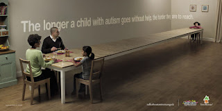
Act Fast. The longer we delay in helping children with autism, the harder they are to reach. Act fast, act today.
Give A Hand To Wildlife. A masterpiece can always attract a lot of attention.
Liked Helping Terceira Island. The evolution of the thumbs up.
Thursday, October 11, 2012
Branding/Identity/Design blog
Interesting design blog! Focused mainly on branding and identity, but includes other aspects of design as well. On this post, they show the studio Lo Siento and their 3D/4d (readable from all sides) typography.
Wednesday, October 10, 2012
Tuesday, October 9, 2012
Ad of the Day: Smirnoff 'nocturnal awakening'
http://www.adweek.com/news/advertising-branding/ad-day-smirnoff-144285
"Smirnoff enjoy a 'nocturnal awakening' in this colorful, raucous and really quite outlandish spot from JWT"
I LOVE the new Smirnoff ad. It's an exciting celebration, of sound, color and texture. Beautiful imagery and narrative. (Scroll down on the ADweek article to see the video.)
Sunday, October 7, 2012
Saturday, October 6, 2012
Thursday, October 4, 2012
Monday, October 1, 2012
too cute.
Let's see…how to promote a TV show about kittens and puppies? By live streaming kittens 24/7 until the new season begins!
Sunday, September 30, 2012
Self Portraits and *drugs*
I hope this isn't too inappropriate.
I thought it was interesting to see the process of a man who completes a series of self portraits on various drugs. I believe it says a lot about how the artist see's himself rather than the effect the drugs had on him.
http://cultso.com/artist-takes-every-drug-known-to-man-draws-self-portraits-after-each-use/
Friday, September 28, 2012
If I am correct, someone for the first project brought a bad ad that was from an a Thailand agency, I couldn't stop thinking how funny and maybe crude this ad might have been, and looking through the internet I encountered this ad for WMF boning knifes.
Personally I think this ad is great, the visual is powerful and eye-catching it cuts straight to the point and gives you a clear idea of what this knifes actually do. I don't know how PETA would feel about this ad, and if it would be well received in the US, but, I don't know, it's just amazing.
Personally I think this ad is great, the visual is powerful and eye-catching it cuts straight to the point and gives you a clear idea of what this knifes actually do. I don't know how PETA would feel about this ad, and if it would be well received in the US, but, I don't know, it's just amazing.
Monday, September 24, 2012
Sunday, September 23, 2012
47 Brilliant Advertisements.
http://www.stumbleupon.com/su/2npMLZ/:1SJ_k+__Y:IzqyhQK7/www.rsvlts.com/2012/08/04/brilliant-advertisements-photos/
Check out this page that shows numerous great ads. They all are relatively simplistic but use, and perhaps rely, on various visual metaphors. Many of these are humorous. Which is one aspect of advertising that can be difficult to accomplish; you don't want to come off as cheesy. But then again, no one wants to sit and take their time to read an ad only later to be left bored and confused.
I enjoy an ad that makes you think. You take in the ad first; the visuals, copy, logo etc.. Then you start to piece all this information together. And once you've understood it, it's like the brand is letting you in on a little joke. It allows the audience to catch on to a narrative, or make a version of their own. All arriving to the same conclusion: buy that product. The trick is, to do this successfully. You don't want to provide your audience with a problem that they cannot solve.
Tuesday, September 18, 2012
Sunday, September 9, 2012
Police Blotter: Humorous Copywriting
http://www.brooklynpaper.com/stories/34/32/fg_88blotter_2011_8_12_bk.html
Check out the various blurbs about recent crimes in Brooklyn. The writers at The Brooklyn Paper take a light-hearted approach to reporting the seemingly endless crimes occurring in Brooklyn.
Check out the various blurbs about recent crimes in Brooklyn. The writers at The Brooklyn Paper take a light-hearted approach to reporting the seemingly endless crimes occurring in Brooklyn.
Friday, September 7, 2012
Monday, April 30, 2012
Subscribe to:
Posts (Atom)


